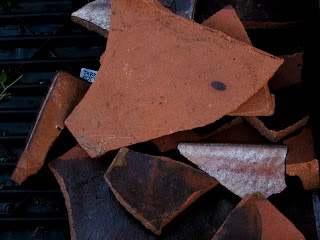
My final folio is a collection of photographs that explores our societies throw away culture. A culture that is obsessed with trends and is ruled by want rather than need. When bulky items are old, broken or just simply no longer wanted they end up on the curb. We throw away objects to make room for our most resent purchases. These photographs illustrate one critical phase in the life cycle of consumed products. Their fate decided by either convenience or creativity.
In this collection I have documented the waste produced by affluent inner city suburbs. The hard rubbish that has been discarded is awaiting one of two futures. It will either be picked up for reuse in some way or made redundant in landfill. A significant number of people simply do not consider the recycling or reuse option. It is often easier to use hard rubbish services than to think creatively or sustainably about waste. This collection of photographs is not just about the existence of hard rubbish, it also explores the transient and ephemeral nature of material objects.
For these images I travelled to many locations in the late afternoon in order to capture a soft warm light. I used my personal Cannon Powershot camera, a tripod and Adobe Photoshop to create sharp, naturally saturated images. In part 1 of my final folio I have explored interesting close up shots that emphasise geometry, line and form. In part 2 the objects are taken from a mid-shot, which provides the viewer with some indication of the location and the context in which the object exists.
Thursday, May 20, 2010
Wednesday, May 19, 2010
Shutter Speed Experiments


I took these photographs as an exploration of night photography. I did not have a tripod with me when I took these images. Instead I sat the camera on the table and just set it on a slow shutter speed. Some of the images did not work out because environmental factors were a particular problem. I was in a busy bar and people kept bumping the table and picking up the glasses. These two images were my favourite because they capture the reflective surface of the table really well. I like the effect of the mirrored image of the background and the glasses. The colour in these images is quite striking. I love the way the light has made the gold liquid shimmer and it has emphasised the outline of each glass. The contrast of gold against a bleak desaturated background encapsulates an almost sickly or isolated feeling. In the second image I like the poster on the window in the background. The poster is seen backwards and makes and interesting contrast against the ambiguity of the beer glasses in the foreground.
Thursday, May 13, 2010
Difficulties Encountered
I have experienced many difficulties with the realisation of my project. The most common problem I had was with the transient nature of my subject matter. I have often driven past an interesting object or arrangement when the light is not right. I plan to return later or the next day but by that time the objects are gone. This simultaneously fascinates and annoying me. I am constantly rushing to locations in an effort to get great shots. I have also found that when their are a couple of days of bad weather I have to put my junk hunts on hold. The light is often too overcast to get the beautiful soft light I aim to capture. This means more missed opportunities to take photographs. In an attempt to reduce the amount of missed opportunities I keep my camera in my hand bag and my tripod in my car. This means that I can snap up photographs when by chance the light is good and I see an object to capture.
Other Influences
Still Life Junk Photography
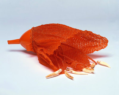
These are a couple of images I found that I liked because of their subject matter. They relate to my theme of junk art, urban decay and the issue of recycling waste. I have been influenced by these images because I have stated to consider the aesthetic of my photographs. I am playing with the idea of realism and colour. I am deciding whether I want my images desaturated with a strong contrast or in colour to document the way they are seen in reality. I will be working in Photoshop to experiment with these ideas.
Chris Jordan


 Simon Lewis
 Ron Chapple
These are a couple of images I found that I liked because of their subject matter. They relate to my theme of junk art, urban decay and the issue of recycling waste. I have been influenced by these images because I have stated to consider the aesthetic of my photographs. I am playing with the idea of realism and colour. I am deciding whether I want my images desaturated with a strong contrast or in colour to document the way they are seen in reality. I will be working in Photoshop to experiment with these ideas.
Chris Jordan


 Simon Lewis
 Ron Chapple
Influencing Photographers


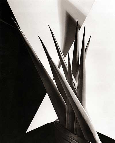
The photography of Imogen Cunningham is quiet delicate and feminine. She captures the fragility and essence of plants, the female form and other still life objects. I have chosen these two images because I am inspired by their illuminated form and the intimacy of each shot. The texture and shape of these objects is emphasised by a light source to the side. the images are close up and focus the viewers attention on the form of the subject matter. Some of Imogen's photographs are so close they are almost abstract. I like this idea of abstraction. Photographing an object so close that the context for which the objects exists is partly lost. It is purely the object represented in an ambiguity of formal elements. The mind has to analyse the elements carefully first then arrange them to make sense. I like the disorientating effect of close ups. The viewer has to think what is it? where was it taken? who owned it? what was happening at the time?
Final Presentation Experiments


These are a series of photographs I took for my final folio. They are mostly experimentation's with light and different compositions. This is just a quick taste of the direction my project is heading and the progress I have made. These unedited images illustrate my interest in geometric forms, still life and junk art.
Friday, May 7, 2010
Extending My Folio Ideas
I originally wanted to take my photographs at night so that I could experiment with Shadow and slow shutter speeds. However after some experimentation I decided that the best light was in the afternoon or early morning. I decided to abandon the idea of dark mysterious photographs and instead focus on line, form, colour and geometric shapes.
My Photography Folio Ideas
I have decided that my final photography folio will document the existence of ephemeral sculptural forms. The sculptural forms I am referring to, are those that intrude our foot paths and nature strips momentarily, then disappear from our urban environment as if they had never existed. Most people are more familiar with the term council collection pick up or throw out days.
After much exploration of different locations, subject matter and concepts within my environment, I found myself mostly intrigued not by people or places, but instead the masses of junk objects thrown out into the street. When searching for inspiration I became bored by the mundane, regular and predictable aesthetic of my neighbourhood. I just could not find something that moved me enough to stop and take a photograph.
While driving home late one night I noticed looming ambiguous objects in the shadows of streetlights. I wanted to return the next night to photograph the objects but unfortunately most of them were gone. I was inspired because I had appreciated these object for their unusual geometrical form and temporary status.
My idea developed as I contemplated the concept of unlikely and unintentional 'art'. I wondered how many people, if any, ever stop as I do to appreciate the oddities of routine everyday life. I began to think about Dada art, junk art and junk art sculpture. Artists such as; Tony Cragg,
  Marciel Duchamp &
  Fiona Hall.
After much exploration of different locations, subject matter and concepts within my environment, I found myself mostly intrigued not by people or places, but instead the masses of junk objects thrown out into the street. When searching for inspiration I became bored by the mundane, regular and predictable aesthetic of my neighbourhood. I just could not find something that moved me enough to stop and take a photograph.
While driving home late one night I noticed looming ambiguous objects in the shadows of streetlights. I wanted to return the next night to photograph the objects but unfortunately most of them were gone. I was inspired because I had appreciated these object for their unusual geometrical form and temporary status.
My idea developed as I contemplated the concept of unlikely and unintentional 'art'. I wondered how many people, if any, ever stop as I do to appreciate the oddities of routine everyday life. I began to think about Dada art, junk art and junk art sculpture.
 Artists such as; Tony Cragg,
  Marciel Duchamp &
  Fiona Hall.
Thursday, April 22, 2010
Broken Glass


 These were just a few experiments I took that I thought worked really well. I liked the combined effect of the glass, ceramic and water. I think the are interesting because of the the sharp lines and the effect of the illuminated white reflections that have been made. The images are almost gritty and textured, while still quite crisp and sharp.
 Thursday, April 15, 2010
Camera RAW
Class Notes
Shooting with RAW files is recommended if the image is to be manipulated in some way in Adobe Photoshop. The RAW format keeps all of the original data when the image is uploaded to a computer. Therefore the RAW image is of the highest quality and ensures only minimal data is lost when the image is processed. When an image is converted to JPG, which is the standard format for digital images, some of the photograph's data is lost. This occurs so that photos are in a smaller file size and is necessary when putting photographs online. Shooting in RAW is recommended but not entirely necessary for our final presentation. However, if I wish to digitally manipulate my images in some way, using RAW files will make them a finer quality.
Shooting with RAW files is recommended if the image is to be manipulated in some way in Adobe Photoshop. The RAW format keeps all of the original data when the image is uploaded to a computer. Therefore the RAW image is of the highest quality and ensures only minimal data is lost when the image is processed. When an image is converted to JPG, which is the standard format for digital images, some of the photograph's data is lost. This occurs so that photos are in a smaller file size and is necessary when putting photographs online. Shooting in RAW is recommended but not entirely necessary for our final presentation. However, if I wish to digitally manipulate my images in some way, using RAW files will make them a finer quality.
PHOTOSHOP
Over the past two weeks I have been using Adobe Photoshop on a regular basis. I'm only just starting to grasp how it works and the type of photo editing that can be done. I have enjoyed using layers as well as being able to touch up colour, contrast and image imperfections. However, I can see how Photoshop can be easily used in excess. It is very easy to get carried away and before you know it your image is pixelated. I think I prefer images that retain their natural quality. Overworking an image in my opinion is distracting. For my final folio I will use Photoshop to change or fix minor details, but I would also like my images to retain a degree of simplicity.
Wednesday, April 14, 2010
Frames, Geometry & Rhythm
Photography of Henri Cartier-Bresson
In these photographs by Henri Cartier-Bresson I like the way he has used the shape of the structures to frame certain aspects of the image. Photographing geometric forms or the shape of a shadow has created an interesting way to highlight a focal point. In most of these photographs the eye is directed by the way light has created lines. These lines seem to assist the eye in navigating its way around the image. This structural focus creates a layered geometric puzzle of form and light, one in which the viewer eye must decode.

Valencia, Spain (1933)

Hyères (1932)
 In 'Simiane-La-Rotonde' (1954) he has used a stark white light to frame the silhouettes of people and emphasise the geometric form of the window.
 The shape of the staircase in Siphnos, Greece (1961) shows repetition, thus the image feels as if it has rhythm and movement as the young girl runs into the distance.
 In much of Cartier-Bresson's work there is a distinct characteristic of repetition, rhythm and form. I believe this is something that I am interested in exploring in my own work. In addition, I would also like to extend this curiosity further by investigating how light falls on such rhythmic forms.
In these photographs by Henri Cartier-Bresson I like the way he has used the shape of the structures to frame certain aspects of the image. Photographing geometric forms or the shape of a shadow has created an interesting way to highlight a focal point. In most of these photographs the eye is directed by the way light has created lines. These lines seem to assist the eye in navigating its way around the image. This structural focus creates a layered geometric puzzle of form and light, one in which the viewer eye must decode.

Valencia, Spain (1933)

Hyères (1932)
 In 'Simiane-La-Rotonde' (1954) he has used a stark white light to frame the silhouettes of people and emphasise the geometric form of the window.
 The shape of the staircase in Siphnos, Greece (1961) shows repetition, thus the image feels as if it has rhythm and movement as the young girl runs into the distance.
Subscribe to:
Posts (Atom)


